Transform Clicks to Customers: The Powerful Science of Conversion-Focused Web Design
In the digital age, traffic is often viewed as the ultimate metric of success. Business owners watch their analytics dashboards, celebrating every uptick in visitors. But traffic, in isolation, is simply a vanity metric. If a thousand people walk past your storefront window but no one opens the door, the business does not grow.
Many small business owners find themselves in this exact position. They have a website that receives traffic but produces very few inquiries, bookings, or sales. The design may look modern, the content may feel accurate, and the colors may match the logo, yet the results remain stagnant. This disconnect happens because the website was likely treated as a piece of digital decoration rather than a strategic system designed to shape behavior.
Conversion-focused web design is the discipline of bridging the gap between traffic and revenue. It is the process of guiding visitors from curiosity to clarity, and from clarity to commitment. When the pathway is thoughtfully built, the website stops being a passive brochure and becomes an active participant in your sales process.
At Aqua Creative Marketing, we believe that conversions do not happen by accident. They emerge from intentional design choices that align with human psychology. For small business website optimization, understanding this distinction is often the turning point between a website that costs money and a website that makes money.
The Psychology of the Click: Conversion-Focused Web Design Shapes Decisions
To understand how to turn a visitor into a customer, we must first understand how people process information online. When a user lands on your website, they do not read in the traditional sense. They scan, they judge, and they react—often in milliseconds.
Every design choice on your page influences how visitors think, feel, and move. This is the foundation of website design for small business: it is not about art; it is about architecture.
Managing Cognitive Load
The human brain has a limited amount of processing power available at any given moment. In conversion-focused web design, we call the effort required to understand a page “cognitive load.” If a website is cluttered, if the navigation is vague, or if the color palette is jarring, the cognitive load spikes. The brain perceives this as “work.”
When a visitor feels like they have to work to understand what you do, their natural instinct is to retreat. This is why “pretty” templates often fail. A template from Canva or Wix might look aesthetically pleasing, but if it lacks a hierarchy that reduces cognitive load, it will not convert.
Conversion-focused web design uses visual elements to manage this load:
- Typography: Fonts are chosen not just for style, but for readability and hierarchy. Large, bold headers tell the brain, “Read this first.”
- Color Theory: Colors are used to direct attention. A bright, contrasting button against a neutral background acts as a beacon, signaling the brain where to click.
- White Space: Empty space is not wasted space. It is an active design element that gives the eyes a place to rest, making the content that is there feel more important and digestible.
The Subconscious “Yes”
Before a customer clicks “Buy” or “Contact Us,” they have already said “yes” to a series of smaller, subconscious questions.
- “Do I trust this site?”
- “Is this relevant to my problem?”
- “Is there a clear solution here?”
Professional conversion-focused web design answers these questions visually before the visitor reads a single word of copy. A clean, structured layout signals professionalism. High-quality imagery signals competence. When these elements align, the visitor’s guard comes down, and they open up to your offer.
Guide Visitors to Meaningful Actions: Gain Structure Through Conversion-Focused Web Design
If the website is a physical store, the “pathway” is the aisle that leads the customer to the checkout counter. On many DIY websites, this pathway is completely blocked, utterly confusing, or virtually non-existent. Visitors arrive and are met with a wall of text, or a menu with twelve different options, leaving them paralyzed by choice.
Conversions happen when pathways are clear. Customer journey design dictates that the visitor must always understand three things:
- Where am I?
- What can I do here?
- Why should I do it?
The Architecture of Pathways
Effective pathways begin with clarity. The “Hero Section” (the top of your homepage) acts as the trailhead. It must contain a headline that communicates value instantly. “We provide accounting services” is a statement of fact. “We save small businesses 20 hours a month on bookkeeping” is a statement of value.
From there, the design must hand-hold the visitor down the page. This is achieved through directional cues.
- Z-Pattern and F-Pattern layouts: These are design structures that mimic the natural movement of the human eye across a screen. By placing key information along these lines, we ensure the visitor sees the most important content without searching for it.
- Logical Sequencing: Pages must connect logically. A visitor reading about “Services” should be presented with a case study or testimonial next (building trust), followed immediately by a Call to Action (CTA).
When professional website design is applied, the visitor never hits a dead end. Every page ends with a suggestion for the next step. This structure encourages forward movement, turning a casual browser into an engaged prospect.
Visual Hierarchy and The “Squint Test”
A common technique designers use is the “Squint Test.” If you squint at your website until it becomes blurry, what stands out? If everything looks the same, the hierarchy is broken.
In a conversion-focused web design, the most important elements—the value proposition and the CTA button—should remain prominent even when blurred. Supporting details should recede into the background. This visual hierarchy ensures that even a user scrolling at high speed captures the core message.
Reducing Friction Increases Movement: Conversion-Focused Web Design in Action
In physics, friction is the force that resists motion. In professional web design, friction is anything that interrupts the visitor’s momentum or causes hesitation. Friction is the enemy of conversion.
Common sources of digital friction include:
- Slow load times.
- Dense, unbroken paragraphs of text.
- Cluttered layouts with too many competing elements.
- Confusing navigation labels (e.g., using “Experience” instead of “Services”).
- Complex forms that ask for too much information upfront.
The Speed of Trust
Friction often manifests as speed—or the lack thereof. In a mobile-first world, users expect a site to load in under three seconds. If it takes five, a significant percentage of traffic bounces back to Google. This is a critical flaw in many visual builders like Squarespace or Wix. While they allow for easy drag-and-drop creation, they often produce “code bloat” in the background, slowing down the site.
Improving small business website performance often starts with technical optimization. A fast-loading homepage encourages exploration. When a page snaps into view instantly, it creates a subconscious feeling of efficiency. The user thinks, “If their website is this efficient, their service must be too.”
Simplifying the “Ask”
Another major source of friction is the “Ask”—the moment you request the user to take action. If your contact form has ten fields, you are asking the user to do a lot of work before they have even spoken to you.
Conversion-focused web design dictates that we reduce the barrier to entry. Instead of a long intake form, use a simple name and email field. Instead of forcing a user to hunt for a phone number, place a “Click to Call” button in the sticky navigation bar.
When a website removes friction, visitors feel more confident. They spend more time on the page, engage more deeply with content, and move through the process with less resistance. This leads to stronger conversions and higher-quality leads.
The “Brochure” vs. The “Engine”: Conversion-Focused Web Design Builds Muscle
For years, the standard approach to website design for small business was the “brochure” model. This model assumes the website is a static reference document—a place to list hours, services, and an address.
In today’s competitive market, the brochure model is obsolete. Your website needs to be an engine.
The Role of Intention
A brochure sits on a table waiting to be picked up. An engine performs actual work. A conversion-focused web design is active. It is built to capture, qualify, and route leads.
This is where the difference between amateur and professional design becomes stark.
- Amateur Design: Focuses on “Does this look cool?”
- Professional Design: Focuses on “Does this work?”
Professional website designers ask strategic questions:
- “How do we guide a user who is just researching versus a user who is ready to buy?”
- “How do we use social proof (testimonials) to counter objections right next to the pricing table?”
- “How does the mobile experience differ from the desktop experience?”
This level of intentionality creates an environment where visitors feel reassured. They are not just looking at a business; they are experiencing a solution to their problem.
Business Growth: Conversion-Focused Web Design’s Exponential Boost
Many businesses underestimate the role of design in their revenue model. They assume conversions come from marketing alone—from Facebook ads, SEO, or networking. While marketing generates the traffic, the website is responsible for the closing.
Throwing money at ads to drive traffic to a non-converting website is like pouring water into a leaking bucket. You might keep the level up for a moment, but you are wasting resources. Optimized website design for small business fixes the bucket.
The Multiplier Effect
When you improve your conversion rate, you make every marketing dollar work harder.
- If your current site converts at 1% and you spend $1,000 to get 1,000 visitors, you get 10 leads. Cost per lead: $100.
- If a redesign improves that conversion rate to 3%, that same $1,000 ad spend generates 30 leads. Cost per lead: $33.
You haven’t spent more on marketing; you have simply utilized conversion-focused web design strategies to capitalize on the traffic you already have. Businesses that adopt this approach gain a competitive advantage. They receive more qualified inquiries because the website filters and educates the user. They experience higher booking rates because the calendar integration is seamless.
Integration with Aqua CRM Plus
However, the conversion event—the moment they click “Submit”—is not the finish line. It is the starting line of the customer relationship.
This is where integrating your conversion-focused site with tools like Aqua CRM Plus becomes a game-changer.
- Immediate Gratification: When a user submits a form, the CRM can trigger an instant, personalized email acknowledging the request.
- Lead Nurturing: If a visitor downloads a guide but doesn’t book a call, the CRM can place them in a nurture sequence, providing value over time until they are ready.
- Data Tracking: You can see exactly which pages the user visited before converting, giving you insight into what content is performing best.
When the professional website design and the operational backend work together, opportunities no longer slip away. The entire customer journey becomes stronger and more stable.
Long-Tail Strategy: How Conversion-Focused Web Design Converts
To achieve this level of performance, we must look at specific, tactical elements. If you are searching for how to design a website that converts, the answer lies in a blend of technical performance and empathetic messaging.
The Value Proposition Headline
Your website has roughly five seconds to answer the visitor’s primary question: “What is in it for me?”
A conversion-focused headline focuses on the result, not the process.
- Weak: “We Sell Insurance.”
- Strong: “Protect Your Family’s Future with Affordable Life Insurance.”
The design should make this headline the most dominant element on the screen.
The “Call to Action” (CTA) Strategy
A common mistake is hiding the CTA or making it passive. “Submit” or “Click Here” are weak commands.
Conversion-focused web design uses action-oriented language:
- “Get My Free Quote”
- “Schedule a Consultation”
- “Start Your Trial”
The design of the button itself matters. It should use a color that contrasts sharply with the rest of the brand palette (e.g., an orange button on a blue and white site). It should appear frequently—once in the header, once after the intro, and again at the bottom of the page.
Social Proof as a Design Element
Trust is the currency of the internet. You can claim you are the best, but visitors want proof.
- Testimonials: Don’t bury these on a separate page. Weave them into the homepage design. Place a testimonial about your speed right next to the section discussing your turnaround time.
- Trust Badges: Display certifications, awards, or “As Seen In” logos.
- Case Studies: Use “Before and After” visuals if applicable.
Mobile Responsiveness is Non-Negotiable
With over 50% of web traffic coming from mobile devices, a site that is difficult to use on a phone will kill conversions.
Responsive website design ensures that buttons are thumb-friendly, text is legible without zooming, and menus are easy to navigate on a small screen. If a user has to pinch-and-zoom to find the “Buy” button, you have lost them completely.
Strengthen Long-Term Success: The ROI of Conversion-Focused Web Design
Investing in professional website design for your small business does more than improve short-term metrics. It creates long-term stability.
Websites built with a conversion structure remain effective as the business evolves because the foundation is built on human behavior rather than fleeting design trends. Trends change—gradients go in and out of style, fonts change popularity—but human psychology remains constant. People will always prefer clarity over confusion. They will always prefer speed over slowness.
Building a Foundation for Growth
When a website is structurally sound, it becomes easier to scale.
- Better SEO: Google favors websites that have low bounce rates and high engagement times. By designing for the user, you inadvertently design for search engines.
- Easier Updates: A structured site is modular. You can add new service pages or landing pages without breaking the overall flow.
- Predictability: A high-converting site provides a steady flow of leads, allowing you to forecast revenue and hire accordingly.
This approach strengthens credibility. It creates predictability for your business. It forms a reliable base for future digital strategy, including automation, advertising, and content marketing.
The Shift from Expense to Asset
Many small business owners view a website redesign as a cost—a necessary evil of doing business. However, when that redesign is focused on conversion, it shifts from an expense to an asset. An asset puts more money in your pocket.
A professional website designed for conversion becomes a trustworthy partner. It does work consistently, supports operations, and contributes to growth. This shift transforms how small businesses view their website and how effectively they can scale.
Conclusion: Conversion-Focused Web Design Transforms Attention into Revenue
Your website is the only salesperson that works 24 hours a day, 365 days a year. It never takes a sick day, and it never asks for a raise. But like any employee, it needs to be trained and equipped to do its job effectively.
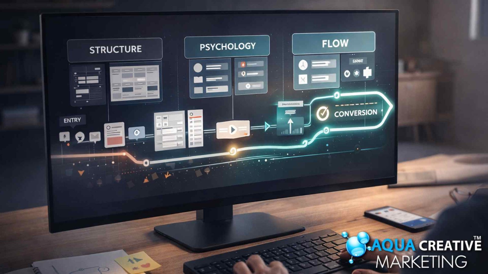
A conversion-focused website design is one of the most powerful tools a business can invest in. Design directs attention. Structure shapes understanding. Pathways guide action. When these elements work together, visitors become customers, and the website becomes an active part of the business engine.
If your website receives clicks but delivers few conversions, the problem is likely not your product or your pricing—it is your pathway. Refining its structure and eliminating friction can create an immediate impact on your bottom line.
Professional website design from Aqua Creative Marketing gives your business a clear, strategic foundation that supports growth long after the initial launch. It moves you away from the frustration of “vanity traffic” and toward the stability of predictable revenue.
Ready to convert your clicks into customers?
Free Website Performance Review or Client Check-In


